How is it already time to be putting together a final portfolio for illustration? I'M NOT READY! I feel like the class just started and I am just starting to get the hang of this. I am definitely going to have to continue illustrating after this class! I don't want to lose what I have learned! Here is a sampling of what I have done over the course of the semester. The first 10 slides are a series of exercises that we did to practice different illustrative techniques.


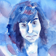
 EXERCISES: I definitely had no idea what I was doing in this class and still barely do. We did all kinds of things including just color work, color and line work, guache pick-outs, and digital illustrations. I didn't really like the digital illustrations which is why there aren't any included. I have really enjoyed the process of this class and am finally getting comfortable with the different mediums. I really like working with guache especially with the pick-out technique. I am also learning to love watercolor because I love the quickness and fluidity of the medium. With illustration I have definitely had to learn not to overwork the images. I really want to keep practicing watercolor/guache because I want to get where I can just lay down color shape in like 2-minutes and it looks like I really had to try! THAT IS MY GOAL!
 MARKER COMP.: How in the world do people produce GOOD marker comps.?! I don't get it. I feel like making marker comps are a whole different technique that you have to learn. How the heck do you blend markers and make them look awesome? I feel like out of all the comps I did this was the one that ended up closest to my final artwork as far as composition and color. One of my frustrations were when I am at home trying to create marker comps. I only have a limited number of colors. This comp was done with the markers at school. For the future I plan on investing on some more markers including lighter tints.
 GUACHE MONTAGE: This was one of my most favorite projects. I really like the guache pick-out technique because I find it easier to start from something rather than nothing. It was also hard to pick three RANDOM images. I actually spent quite a bit of time thinking about what random images could work compositionally together. This was a fun project because even if you don't intentionally want there to be content in your artwork someone will find a meaning somehow.
 PRODUCT ILLUSTRATION: The product illustration was kind of a fun project. It was different than our others in that it required a lot of time and attention to detail. For the medium I used guache because I wanted it to be very opaque but still be able to act as watercolor. I also chose the Heineken bottle because it was very bright and I wanted to tackle the challenge of imitating water droplets. The hardest part for me was probably loosening up to create the really tiny 'implied' text. I was really happy with how this turned out. If I were to do it again I would illustrate it at a much larger scale than the original. I did this illustration not much bigger than the final printed artwork.
 DUST JACKET: For the book cover dust jacket I chose do the classic book 1984 by George Orwell. I chose to do the guache pick-out technique because I feel like it is one of my strongest. I really like making designed work like this because it is a fun challenge to figure out how to layout imagery and text cohesively. If I did this again I would definitely design the front and the back cover at the same time. I did the back illustration pretty quickly after I had already started putting the entire design together. I would have like to have some kind of wrap around illustration besides just a visual texture on the back. I am still really happy with how it turned out. I definitely think it looks like something that could be sold in stores!
 ALBUM COVER ART: I was really excited about this project. I always love looking at album artwork on CD covers and am usually drawn to illustrated covers. For this my goal was to go back to watercolors because I wanted a more fluid feel. I was really excited how these covers printed. They were so vibrant and eye catching. This was exactly what I had hoped for. For the future I really want to work on incorporating color and line work better. For some reason I am stuck on only being able to use one thing at a time. I need to get more confident in my drawing skills.
So this is Illustration in a nutshell!
CAN I TAKE THIS CLASS AGAIN?!
Just kidding, but I feel like I have barely got exposed to this field.