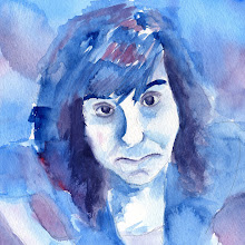

We are taking a little break from designing posters and moving onto a two-page magazine layout. The layout is for an article about stress in Mature Living magazine. This was pretty difficult because there was so much text to deal with. I spent most the time formatting the body copy. I had to separate the text into paragraphs, apply indents, and figure out what would be a few good quotes to pull from the text. I also haven't dealt with InDesign very much so that made this even more difficult. I feel a little limited. I chose these colors because I feel like they are kind of calming and tranquil. Then the orange red provides a little stress into the mix.
I'm still playing around with image ideas. I realized after that this image will probably not be appropriate for this magazine considering the target audience is people over forty. I feel like this is a good start for the layout and the body copy is pretty much where I want it. I also want to figure out a way to make the second page a little more interesting. It's kind of a little boring right now with so much text.


1 comments:
This layout is definitely pretty boring!
Post a Comment