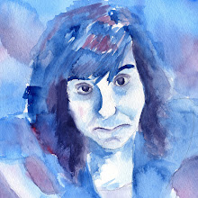
Here is the final poster and illustration to advertise "Stitch 'n Bitch". I feel like my concept was a good idea but I had trouble executing it. This was my first attempt at using illustration board. I don't know if it was my problem or what, but i felt like the colors just soaked into the board and I couldn't get effects that I use with watercolor paper. I also had a hard time with contrast because my blue background ended up being a lot darker than I originally planned. If I were to re-do the illustration I would create something that didn't involve a background but just an object by itself. Having a background didn't allow me to be as flexible with the placement of the text. I would have like to play around with putting text partially behind or in front of my illustration. I hate how boxy it is appearing.


0 comments:
Post a Comment