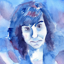

 Here are the second revisions for the three layouts using our professional photo. I'm still having trouble linking my C.O.B. from photoshop to InDesign. There is always a slight white border around my object no matter how many times I redo the clipping path. So, to solve this problem I just decided to build the whole header separately and then link the whole thing over into InDesign. I did this on the Tower Arch magazine layout. I really like how this spread is developing.
 For the poster I decided to kind of just start over completely. I did a different illustration effect on the image and made it more dominant. I also like how the text and information is now neatly ran down the side of the poster. I did this in a five column grid.
Oh....Van Gorkom. Not sure how this one is going. I moved the header "Van Gorkom" down to the bottom to create a logo. Then I tried to create a title using the pull quote that I had used. Does it look more like a magazine ad now?


0 comments:
Post a Comment