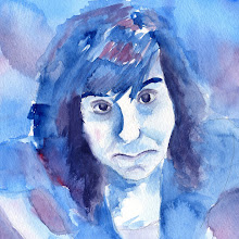
 The poster is really different than what I'm used to doing. The poster has a lot of text on it but in no way is the text dominant at all. I really like that the image takes up the whole space of the poster pretty much. I like the idea of having a poster and then basically attaching this little side bar to it. I wasn't sure at first how that would work. I was worried it would be unbalanced, but it definitely adds instead of takes away from the layout. The effects on the image kind of play off the different summer events. The image is kind of photography, painting, and drawing all rolled into one! I like that concept.
 The magazine spread I feel also comes across as pretty successful. It is a really clean and simple layout, easy to read. Instead of doing a traditional side bar of information, moved the side bar to the bottom of the page. In this case, I feel it works well because I wanted the pictures to not be super tiny but have a little more importance. Out of all the three layouts I spent the most time and did the most versions on this magazine spread. I ended up doing about six versions before the final.
 This is the final version of the spread advertising Van Gorkom hiking boots. I really like how this layout progressed. I feel like it really does look like an advertisement, especially with the large boots! I also broke away from normal magazine layouts and did the image across the whole top half of the page.
My only issue still is the boots have a slight edge of color on them. I still am not doing the clipping path correctly. I need some one-on-one teaching to learn the correct process.


0 comments:
Post a Comment